Recommended use of fonts
I've spent several hours reading up about best use of font sizes. Time and time again I found the same information - readers scan text written in a big font, whilst they read text written in a small font - around 12pt size.
I've spent several hours reading up about best use of font sizes. Time and time again I found the same information - readers scan text written in a big font, whilst they read text written in a small font - around 12pt size.
What am I talking about?
The first two paragraphs say exactly the same thing, which did you really read?
According to studies you will have started to read the first paragraph but ended up scanning it, the second paragraph you would have read normally.
Best practice
Use H1 font for your main page heading only, keep it succinct - up to 5-7 words.
Use P for paragraphs.
Use H2 for side headings to break up the text again no more than 5-7 words.
Do you find paragraph text small?
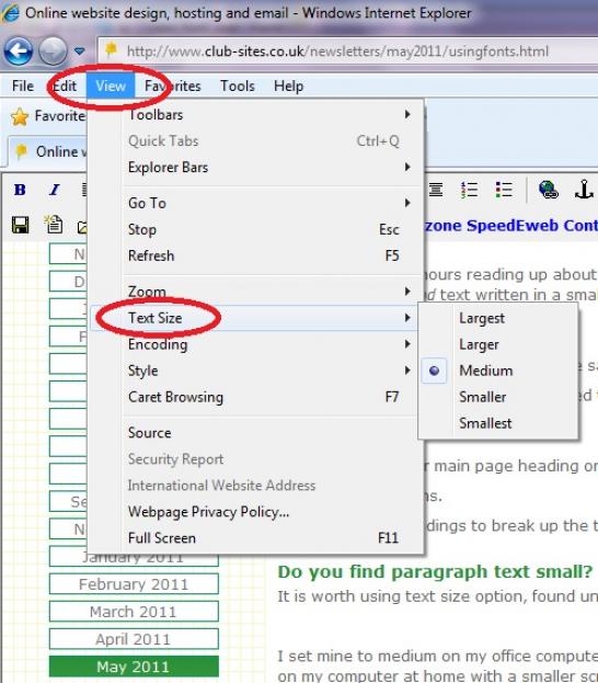
It is worth using text size option on your browser, you'll find it under View on the Internet Explorers' bar (top of the screen, just under your website address):

I set mine to medium on my office computer - it works well with the size of screen I'm using, but you might find it useful to adjust your setting as I have on my computer at home with a smaller screen.
Examples worth bearing in mind
The BBC news website is read by millions each day, have a look at how they construct their main page and then at a news item.
http://www.bbc.co.uk/news/ I counted 4 font sizes on this page.
http://www.bbc.co.uk/news/business-13443055 I counted 3 on this page: header, side heading and paragraph (I didn't identify bold as a separate font).
http://www.hillingdon.gov.uk/ Recently won website accessibility award at the Good Communications Awards 2010
Note sure how to use the font function?
Have a look at our section on Fonts in detail...
[Back]


